I’ve been working in the UX design & research industry for 16 years, and five years ago, I found myself on a motorcycle.
A special thing about our relationship is that I rarely ride in the city but regularly go on long journeys. These journeys include asphalt and dirt, riding in the rain and cold, with and without route knowledge. In other words, it’s never boring.
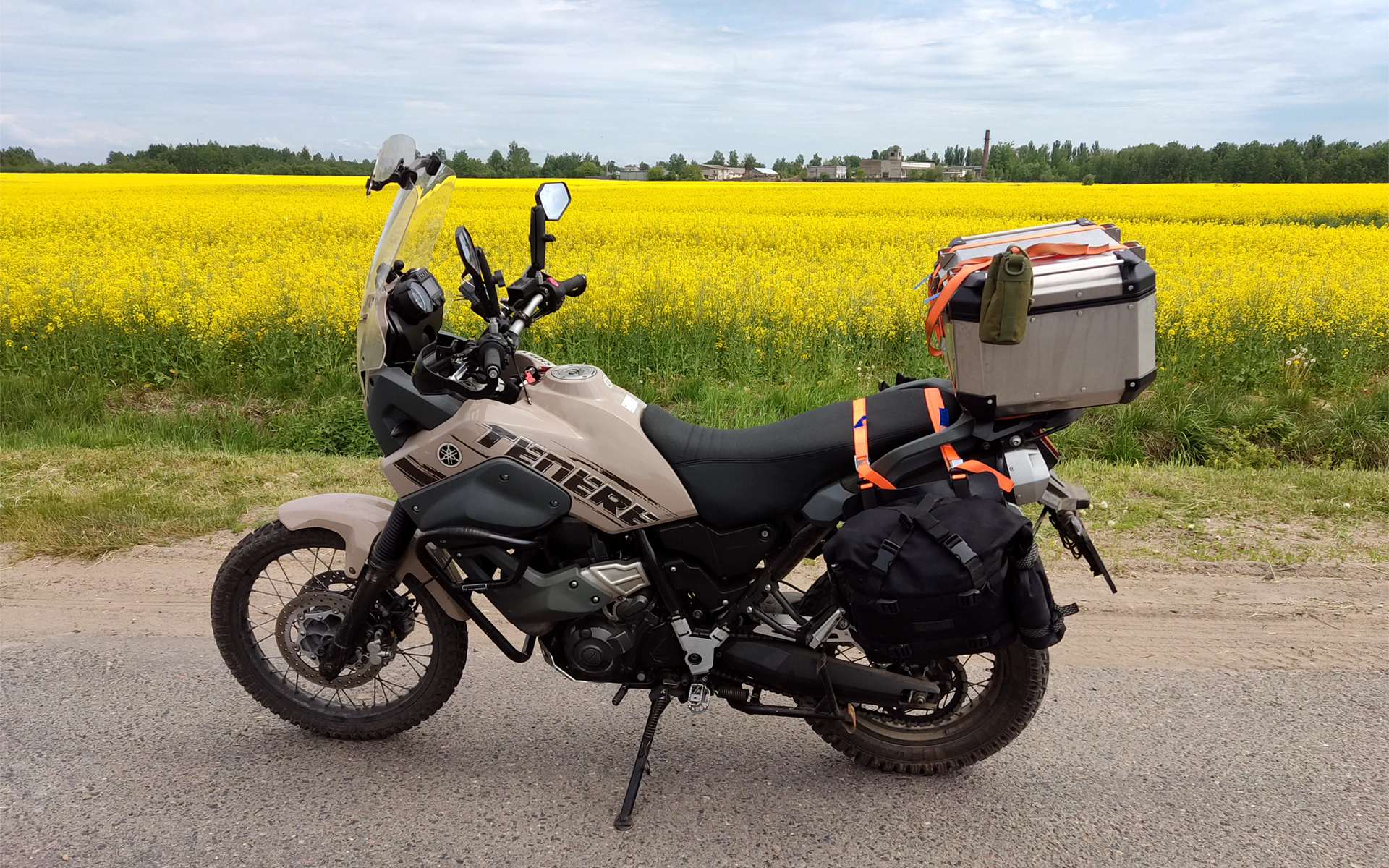
Eventually, your motorcycle becomes an extension of you. Whether you can handle a long journey, what kind of memories you will leave with, and your safety — well, all these things depend on it. And even though I love my old proven Yamaha, after some time, I began to see its flaws.
One of the flaws is that my motorcycle is quite far from the modern standards of a good UX
Need full-featured navigation while traveling? You’ll have to buy and install a separate navigator (when was the last time you saw such a thing in a car?) or use your phone, which probably isn’t rainproof.
Want to check the weather forecast to see if it’s time to put on your rain jacket? You’ll have to stop, take off your gloves, and use your phone.
Open garage doors or ask the voice assistant to read a recent text? Forget it.
Is something broken? You’ll have to solve this problem by diving into the fascinating world of parts ordering.
My motorcycle lives a simple life. And it was a norm those days, before iPhones, smart speakers, streaming services, and EVs.
And a few years have passed. What’s the state?
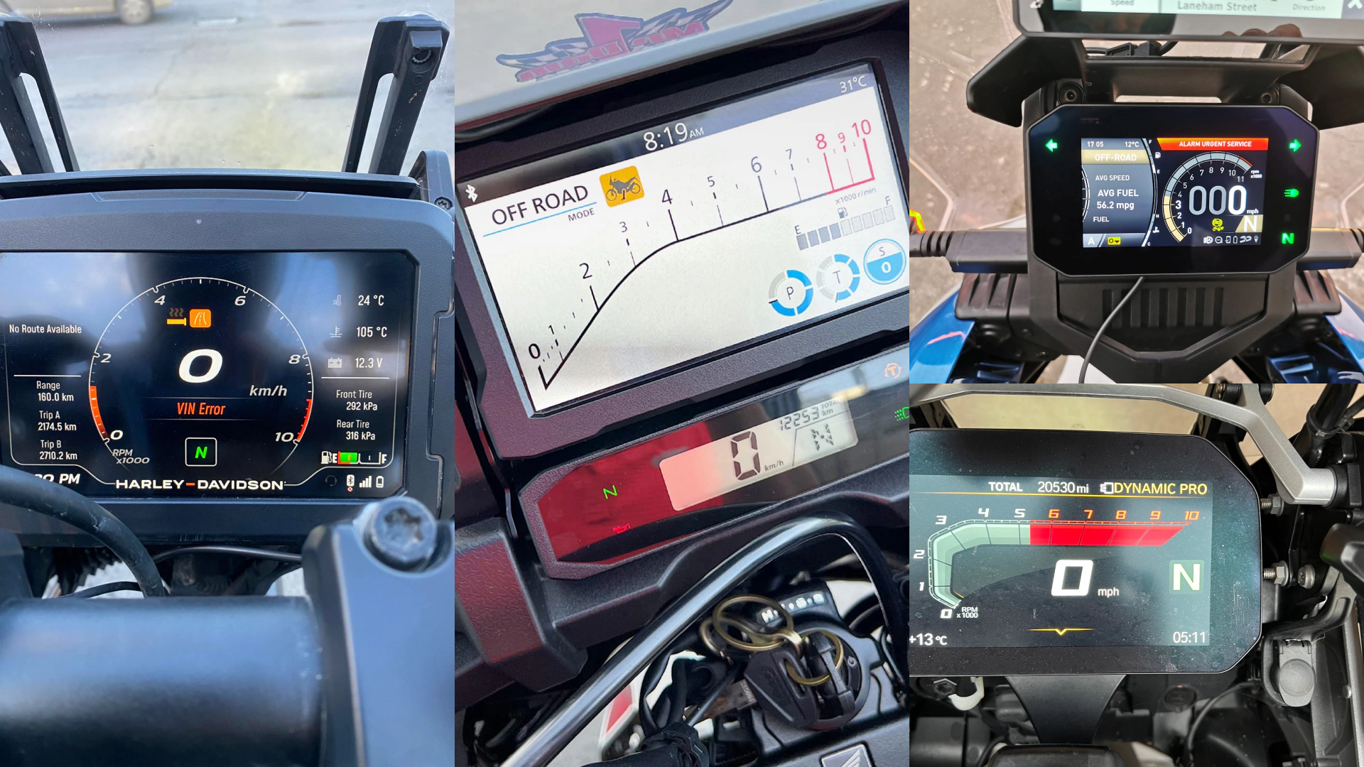
The experience of interacting with motorcycles and manufacturers isn’t seamless — digital ecosystems are just starting to emerge. It means that the dashboard, websites, assistant apps, etc., live their own lives, and functional overloading at specific touchpoints (such as the dashboard) has reached critical levels. And it’s not good for UX.
Motorcycles are still not integrated into the IoT. Imagine that your phone has no Internet access, and to use YouTube, you need to connect a separate device, which tends to drain. Sounds unusual? But that’s how most motorcycles work — you need a phone with internet access to use simple turn-by-turn navigation. Your motorcycle is always offline until you get it online.
Photo by Adam Feyrer on Unsplash
The same with high-performance GPS modules, which would provide navigation without using a phone: if there is a motorcycle with such a module comes from the factory, it’s not a mass phenomenon.
User interfaces still require adaptation to new screen technologies. They often inherit interaction patterns from their analog predecessors, and in many cases, it doesn’t work well. A simple illustration: in the past, manufacturers used bulbs to show that the turn signals were on. Now those “bulbs” have migrated to TFT displays, even though the new technology makes it possible to improve them (who forgot to turn off the turn signals because the bulb wasn’t noticeable enough?).
What else doesn’t help is a variety
There are a lot of reasons why people ride motorcycles. For some, it’s a quick way to get to work. For some, it’s a way to have new experiences or make new acquaintances. Some are professional athletes. And we can’t say that one group or another is marginal.
Some have just graduated from motorcycle school and are (rightly) afraid of every trip into the city with heavy traffic. Some turn off the ABS on dirt roads because they understand how ABS works and know when it’s more of a hindrance than a help. Some service the motorcycle and order parts as a hobby, while others go to their dealer.
All these people have different motivations, levels of engagement, and training. They face all kinds of challenges and barriers.
Riders and motorcycles (yet?) aren’t as homogeneous as drivers and cars. And that makes the task quite challenging.
So, are there any ways to improve it?
Alas, there are objective reasons for too many flaws. It’s impossible to install a powerful microcontroller on every motorcycle. We can’t count on a large screen everywhere to make one perfect UI for all situations. Just because there are types of motorcycles, such as enduros, where a large screen is not just excessive but harmful — it adds weight when it counts in grams.
But as a designer, researcher, and manager, I can suggest a few ways to increase the tempo and quality of improvements. Here they are:
- Look at the whole system, not isolated touchpoints.
- Strive for innovation, but don’t overlook proven solutions.
- Define and apply your principles.
Look at the whole system, not isolated touchpoints
The easiest way not to achieve significant progress is to analyze only one part of a system. We shouldn’t limit the task and think only about improving the dashboard. It’s just one of the touchpoints.
Instead, we should imply that:
- There is a whole process of interaction. Let’s call it “being a motorcyclist”.
- Many people/subjects are involved in this process: from the rider, their co-pilot, and riding fellows to the manufacturer, their representatives, and affiliates.
- People go through numerous stages of interaction. For example, if we take a rider — from their first thought about a motorcycle to this moment when they have owned it for many years and gone through a complete transformation of skills, habits, and goals.
- Each person has different goals and ways of achieving them at each stage.
- There are a lot of touchpoints through which people achieve their goals: from the manufacturer’s website, motorcycle dashboard, and mobile assistant apps to dealerships, social networks, aftermarket stores, and even motorcycle manuals.
- At the intersection are barriers that keep people from moving forward in stages. And barriers caused by interfaces can only be the tip of the iceberg.
The ability to see the whole system and understand how we can affect its parts helps to find minimal necessary changes that lead to noticeable improvements.
What are the ways to study the system? First and foremost, it’s user research. Especially those types which help clearly understand why people act one way or another: in-depth interviews, moderated usability tests, shop-along, etc. Speaking of others, I would think of Customer Journey Maps.
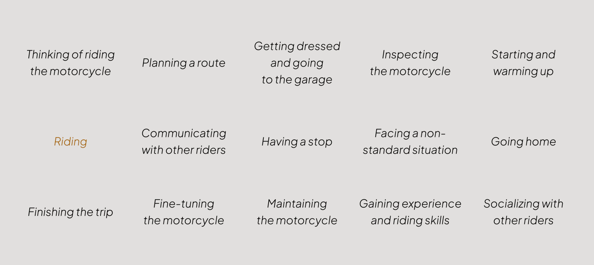
I like to see work on CJM as a way to eliminate cognitive inertia. When you build a CJM, even without massive research data, you think of the stages the rider goes through almost inevitably. And then, as you elaborate on those stages, breaking them down into goals, scenarios, barriers, touchpoints, etc., you see previously hidden solutions. It’s a great exercise to stretch your brain. Imagine your motorcycle could:
- Not just plan a route from A to B, but plan an enjoyable weekend or a whole week trip with your preferences and capabilities in mind.
- Show how much you need to inflate your tires before you leave — with no specific actions.
- Open and close your garage doors automatically — again, without pressing any button.
- Automatically recognize speed limit signs and warn you when you are over the limit.
- Adjust the heated grips’ temperature using the voice assistant.
- Read the last text by voice.
- Check the availability of gas stations along the route and suggest you refuel at a particular one in advance, taking into account the remaining fuel.
- Suggest where to eat on the road based on your usual preferences.
- Find a free parking space, and help with payment.
- Suggest a hotel with private parking (where your motorcycle will be safe) in advance while you still have time to choose.
- Predict failures and provide service much earlier than you find yourself in a difficult position.
- Book you for service at the dealer or order parts.
- Let your family know that you are OK when you are on a long journey.
- Automatically call emergency services in case of an accident.
- Improve the riding skills you lack based on telemetry data.
- Develop habits that help you ride safely.
Although these opportunities to improve the UX (a separate question — to what extent, but still) lie on the surface, it’s impossible to see them assuming that the only activity looks like this:

But assuming there is life before and after, the space for finding product ideas and improving the UX expands greatly.
Strive for innovation, but don’t overlook proven solutions
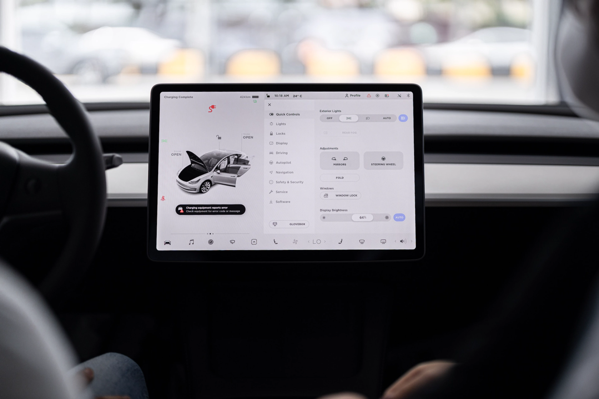
Photo by SCREEN POST on Unsplash
I see proven solutions not reproduced in modern interfaces. I see the same manufacturer solving the same problem differently with no practical reason. At the same time, I see solutions that have become standards in other industries — extensive use of voice assistants, AI, etc., coming late to the motorcycle world.
How to stop reinventing the wheel and start moving faster?
Create and support an internal collection of inspirational UX/service design patterns
It’s like a spare memory. We can collect examples from our past, solutions from other manufacturers, cars — modern and classic, EVs, or futuristic spaceships — it doesn’t matter. What matters is that every time we have a challenge, we should be able to consult with that experience and make the best decision.
What might it look like? For example, we should be able to find everything related to a topic or task. And, of course, every solution should have a description: why it works, why it’s better than analogs, what supportive research data we have, etc. It can be a database in Airtable or even something with a pinch of chatbot experience:
Define and apply your principles
I’m sure that we can’t develop without a benchmark: if we don’t know where we want to arrive, we’ll get there only by accident. Or years later.
So, let’s assume that we need a benchmark. For this role, we can use something that describes what our product, process, interface, etc., should conform to. But where do we get it?
A viable method for defining such principles is to understand what practices you don’t want to replicate based on your own experiences or those of your competitors
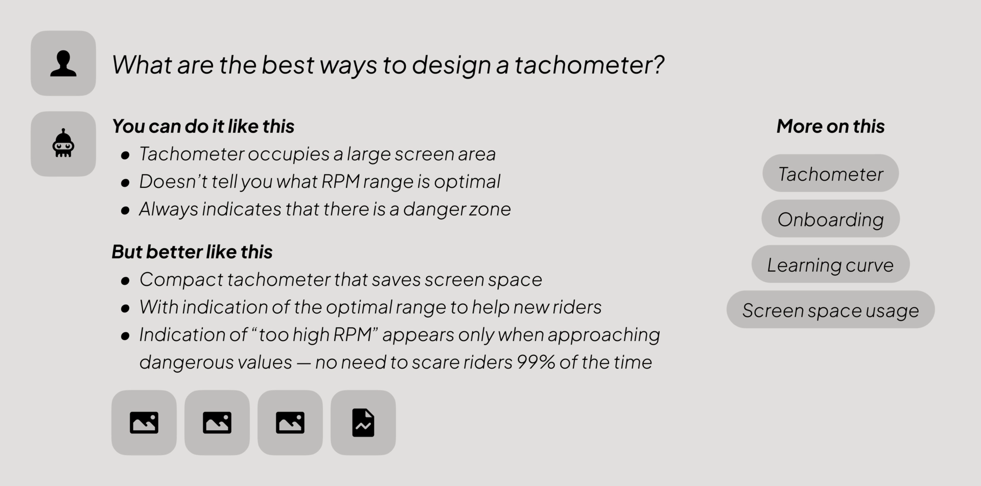
After examining modern motorcycle interfaces, I created an example to illustrate this concept. It’s worth noting that these principles aren’t universal and should be adapted to meet your needs.
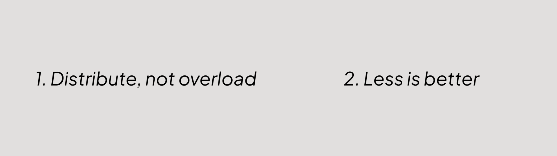
Principle #1. Distribute, not overload
Many actions with a modern motorcycle don’t have to be performed while standing next to it
Look at a modern car. We have a dashboard and a central console with a touch screen. In most cases, the dashboard contains only essential features that help you to control your car and plan your trip.
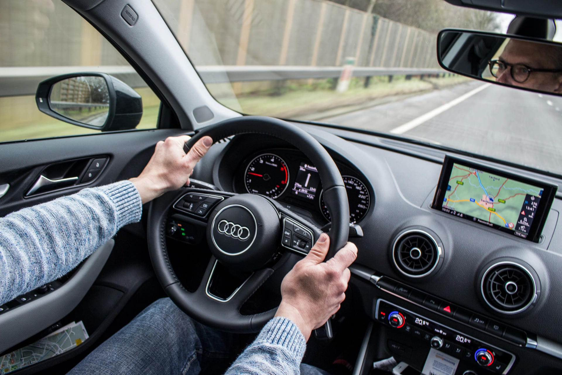
Photo by Jannis Lucas on Unsplash
Can we make the dashboard more functional? Sure, but then we would encourage the driver to shift their focus from the road to the screen. Instead, the console is dedicated to entertainment and solving occasional or rare tasks. Usually, it’s not too convenient to work with it while driving (this has both minuses and pluses), but when parked, it’s a regular tablet.
With motorcycles, the situation is different: everything you can do, you do on a relatively small dashboard screen. Sometimes with the remote control on the handlebar. Standing in the garage, not sitting in a soft chair, watching YouTube in parallel. It doesn’t sound like a car.
The idea is to distribute the functions between different touchpoints and put them where they are possible and needed, rather than concentrating solely on the motorcycle.
Things you can and prefer to do at home on the couch, you should do exactly there
So let’s take the detailed (and rarely used) electronic suspension settings and some other things and move them to… well, for example, to a mobile app. Here we keep in mind that the motorcycle is supposed to become a part of the IoT, so it wouldn’t be surprising if it gets the settings from the cloud. If we find ourselves in a remote location without internet access, we can still rely on Bluetooth.
The dashboard keeps functions that are vital during the trip, for example, ABS mode switching in case of an adventure bike. But not an opportunity to change the speedo measuring units.
Principle #2. Less is better
We shouldn’t show everything we have just because we can
Dozens of on-screen stimuli (every interface object is a stimulus) don’t lead to a better interface, especially when we need to minimize the time rider looks at the screen rather than the road.
The other reason is somewhat philosophical. When I, as a designer, place objects on the screen, I know I need to answer several questions, such as:
- What characterizes the people who will use this object? What are their skills? Under what circumstances and in what environment will they use it?
- What are the goals of its use?
- Is its appearance conducive to ensuring that people with specific characteristics will achieve their goals?
- How is this task solved in similar interfaces (=is there a pattern that people are used to?)
- Can we get rid of this object to get an interface “with no interface”?
- Should we place it exactly here?
- How much visual weight should it have (=how quickly should it draw attention to itself)?
- Should it always be visible or only under certain conditions?
- etc.
The primary sources of answers to these questions are user research, basic principles of ergonomics, and experience observing how people interact with interfaces. Anyway, I make a decision every time, and the more questions I ask, the harder that decision is. And, to be honest, the better the result.
Is it hard to decide based on a statement like “I have an object, and I put it here because I have it”? Not at all — it’s a simple decision. Do designers act this way? Oh yes, precisely because it’s a very affordable, almost reflexive way. Is it possible to get a successful interface this way? Only by accident.
The presence and appearance of any interface object must be determined by data and a set of reasons (preferably objective). No data and reasons — no object.
Results?
As a designer, I was curious to meet a million incompatible requirements. So, I made a design concept with this approach in mind.
Of course, some of my assumptions need to be verified. On the other hand, I rely on my extensive research and management experience, so with some probability, I can say which solutions almost certainly won’t work. And I did my best to include none of them.
Conclusion
Sooner or later, manufacturers will come to a point where UX/CX becomes a significant competitive factor. That happens in every mature industry. Of course, no one will replace an HD for a BMW just because of the user experience quality — they are different motorcycling styles. Of course, the price will remain the main rational choice factor.
But when it comes to emotional factors, the fact that the manufacturer provides the best buying and ownership experience can be decisive. After all, the quality of the user experience makes Apple what they are.